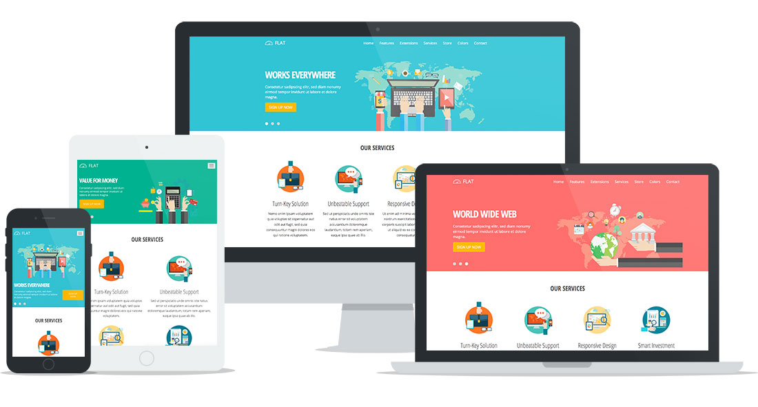
Flat design become popular in responsive design era because it's based on simple elements without any illusion of three dimensional space. Elements that provide a three-dimensional illusion, such as borders, shadows, and textures are omitted in flat designs. Therefore, flat designs are focused on a minimalist use of simple elements and flat colors. Such elements create a clean user interface that can be reproduced perfectly on all screen sizes. If a website is based on the flat Joomla template, it will give the same feeling on all devices used to access this website.
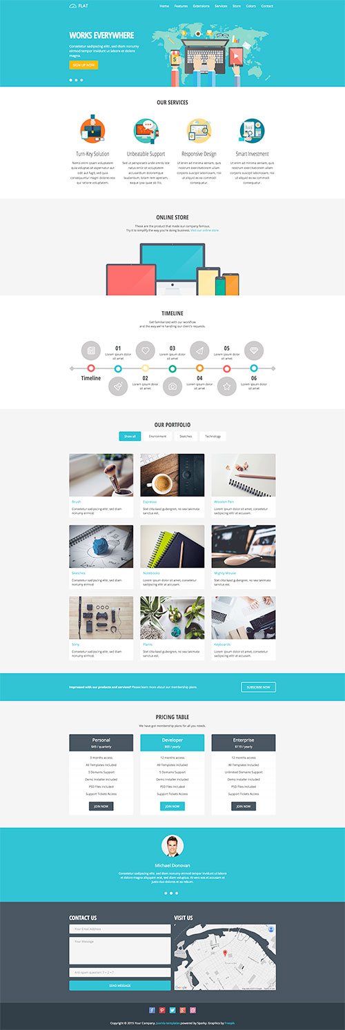
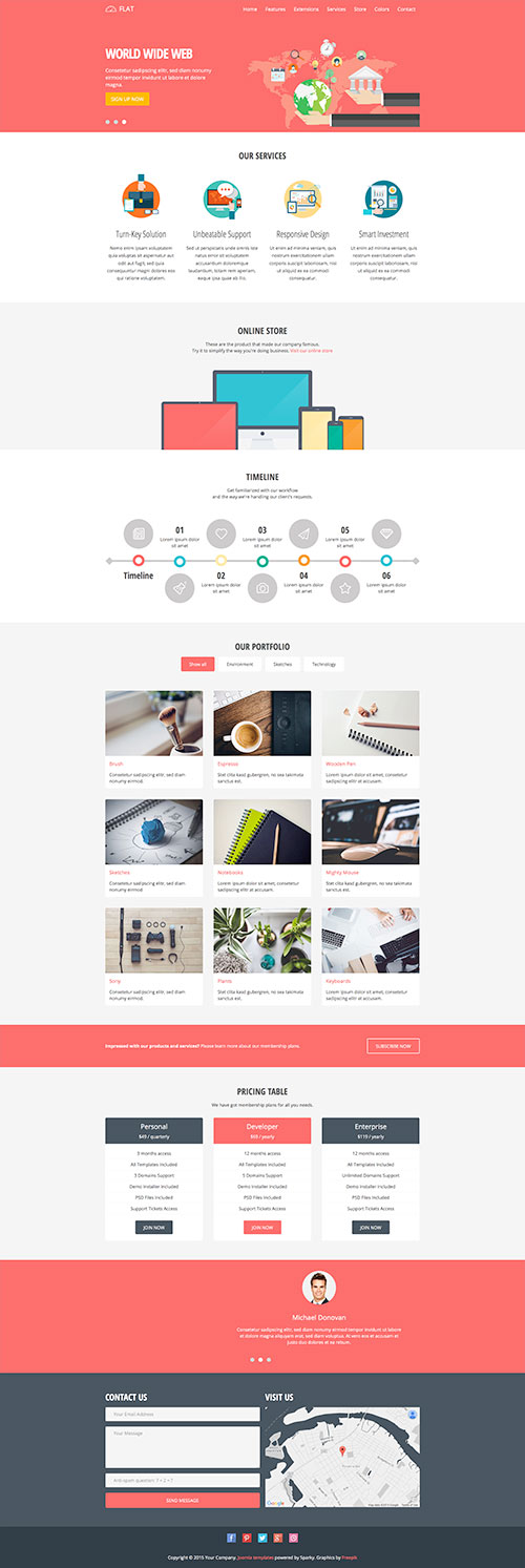
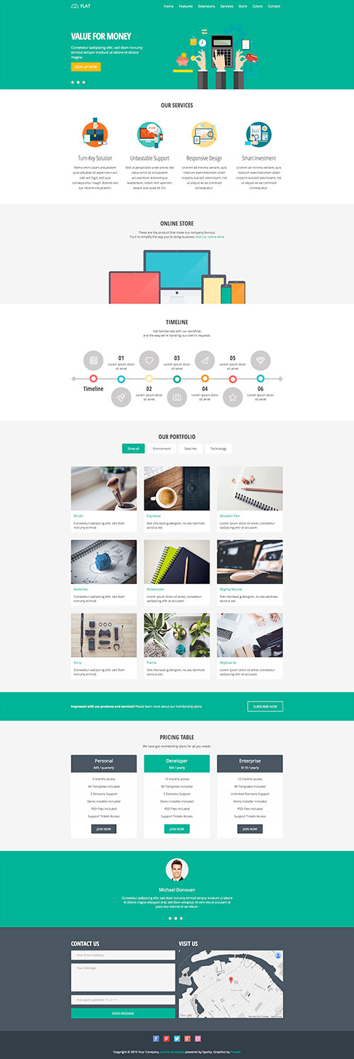
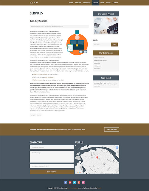
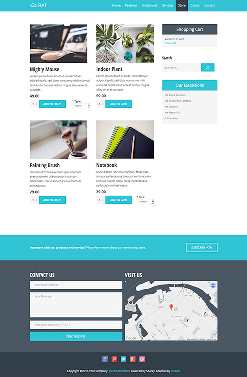
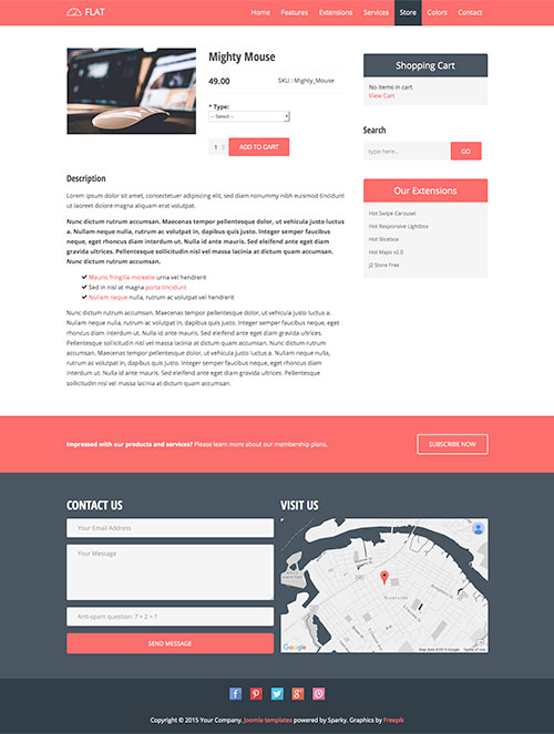
The home page of the flat Joomla template is a long page with many elements that you can use or change to fit your needs or even disable. The Hot Swipe Carousel below the top menu changes the layout according to the screen space. It's can be controlled easily on touch screens with touch gestures. The main content has one column on the home page and two columns on the inner pages (the right column is added).
There is a new element in the flat Joomla template that is never used on our templates before. This new feature that you can see on this flat template is filterable content boxes. Check how they look and work under the Our Portfolio section on the flat template demo. You can put any content inside the boxes and create as many categories as you need. The filterable content boxes can be used as a module (they are used like that on this Flat Joomla template) or you can include them even in your articles. Please read our tutorial about filterable content boxes in Joomla for more details.
Flat template also contains a design for the pricing table. It's made as a custom HTML module, so you can change its content easily. Another instance of the Swipe Carousel contains clients' testimonials. Finally, the Flat Joomla template includes a contact module (powered by Rapid Contact) and the Google maps module. The maps are based on our latest Hot Maps v2.0 module, powered by Google Maps API.
Flat Joomla Template Screen Shots
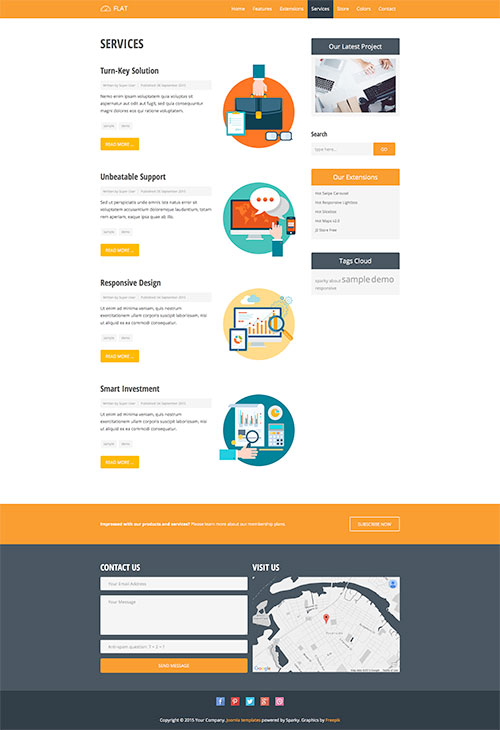
Template Key Features
This is a quick overview of the template's features:
- Responsive template, based on clean HTML5/CSS3 code, and powered by Sparky Framework for Joomla.
- 5 pre-defined color styles. All colors are easily customizable from the Sparky options (infinite color options).
- Customization of the template's layout and adding/removing module positions is easy. It's powered by Sparky's drag-and-drop Layout Editor. Change layout and element dimensions easily whenever you need.
- We included several responsive Joomla modules with this template. Hot Swipe Carousel, Hot Slicebox, Hot Responsive Lightbox and Hot Maps v2.0 module (new version). All these modules are included with this template without additional fees (you save $19 per commercial module). There are also some third-party's extensions included. Rapid Contact module is used for the contact form in footer. It is styled and configured for this template.
- HotStart (SQL dump) available with both single purchase or membership plan. It copies the template with all extensions and demo pages easily.
- An unlimited number of module positions can be added easily within the Layout Editor of Sparky Framework if needed.
- PSD source file and fonts are included.
- Total control of all menus through the framework. You can set the functionalities and style of all your menus and drop them directly into the layout. The top menu with drop-down sub-levels is included. The top menu converts to a button for easier navigation on mobile devices.
- This template is tested with Firefox, Chrome, Safari, Opera, and IE9+ browser. It's also tested on iOS and Android mobile devices.
- Google Mobile-friendly Test Passed.
- Support for RTL (right-to-left) languages.