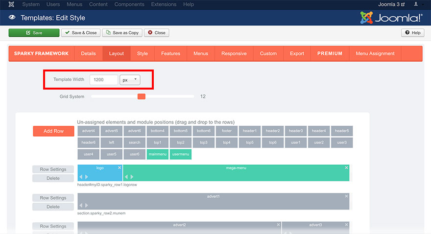
The first parameter in the Layout tab is Template Width and it determines the maximum width of your site. It’s maximum width because, if responsive mode is enabled, site width will decrease on smaller screens. If responsive mode is disabled, site width will be fixed regardless of the screen size.
Usually, Template Width parameter is in pixels. But you can use relative units as well.
You can use % as unit if you want your site to have width relative to the window width. In example, if you want your site to use full size of the window (no matter how screen is big), enter value 100 and select % for units. You can also enter smaller values, in example, 90%. In this case, site width will be 90% of the window size, regardless of the window size.

Sample
The header uses site width defined in the parameter, but carousel row uses 100% width. This is a sample from the Hair Salon template. This template is available for all premium members.
