
- Posts: 1
- Thank you received: 0
responsive - font size
4 years 2 months ago #48421
by marecza
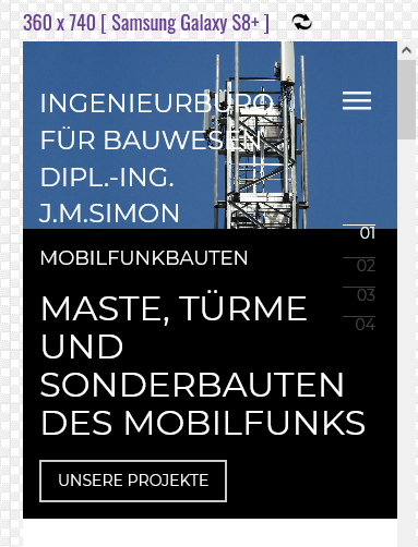 how to reduce the font size for e.g. a mobile phone.an example in the attachment
responsive - font size was created by marecza
Please Log in to join the conversation.

4 years 2 months ago #48423
by milos
Replied by milos on topic responsive - font size
Hello,
You can reduce font size for mobile devices only if you add a media query in CSS. For example, in the template options, under Custom > CSS tab you can add this:
to reduce the logo text to 14px if screen width is less than 500px.
You can also reduce carousel text (heading and regular text) like this:
You can change the values in the code as appropriate.
Regards,
Milos
You can reduce font size for mobile devices only if you add a media query in CSS. For example, in the template options, under Custom > CSS tab you can add this:
Code:
@media (max-width: 500px) {
.sparky_logo {
font-size: 14px;
}
}
to reduce the logo text to 14px if screen width is less than 500px.
You can also reduce carousel text (heading and regular text) like this:
Code:
@media (max-width: 500px) {
.hot_swipe_carousel_slides .contents {
font-size: 14px !important;
}
.hot_swipe_carousel_slides .contents h2 {
font-size: 18px !important;
}
}
You can change the values in the code as appropriate.
Regards,
Milos
Please Log in to join the conversation.
Time to create page: 0.202 seconds