- Posts: 9
- Thank you received: 0
Hiding modules in mobile view
-
alan
Inactive member -

- New Member
-

Less
More
9 years 4 months ago #46136
by alan
Replied by alan on topic Hiding modules in mobile view
Hi,
Has this been updated in Sparky 2.1 or should changes be made to the index and css?
regards
Alan
Has this been updated in Sparky 2.1 or should changes be made to the index and css?
regards
Alan
Please Log in to join the conversation.
-
milos
Support Staff -

- Moderator
-

Less
More
- Posts: 6806
- Thank you received: 724
9 years 4 months ago #46137
by milos
Replied by milos on topic Hiding modules in mobile view
Hello,
No, Sparky is responsive and it doesn't hide anything. You can add media queries to hide some module positions for certain screen widths, in example:
Regards
No, Sparky is responsive and it doesn't hide anything. You can add media queries to hide some module positions for certain screen widths, in example:
Code:
/*------------ hide module position LEFT if screen width is less than 767px ---------------*/
@media (max-width: 767px) {
.mp_left {
display: none;
}
}
Regards
Please Log in to join the conversation.
-
alan
Inactive member -
- New Member
-
Less
More
- Posts: 9
- Thank you received: 0
9 years 4 months ago #46139
by alan
Replied by alan on topic Hiding modules in mobile view
Hi Milos,
Many thanks, yes that works ok.
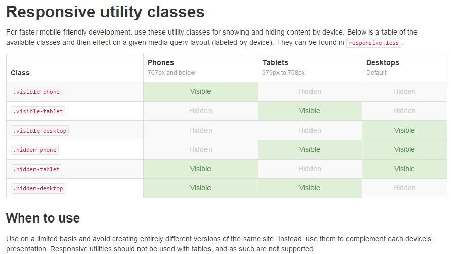
I appreciate that Sparky is responsive, but there are occasions when there is a need to "swap" content. It might be that a detail image doesn't display well when resized, and then it might be better to replace it with a simple text description.
Bootstrap offers the facility to choose the class, is it possible to add this to Sparky?
getbootstrap.com/2.3.2/scaffolding.html
Regards
Alan
Many thanks, yes that works ok.
I appreciate that Sparky is responsive, but there are occasions when there is a need to "swap" content. It might be that a detail image doesn't display well when resized, and then it might be better to replace it with a simple text description.
Bootstrap offers the facility to choose the class, is it possible to add this to Sparky?
getbootstrap.com/2.3.2/scaffolding.html
Regards
Alan
Please Log in to join the conversation.
-
milos
Support Staff -
- Moderator
-
Less
More
- Posts: 6806
- Thank you received: 724
9 years 4 months ago #46141
by milos
Replied by milos on topic Hiding modules in mobile view
Hello,
It's a good idea and I bookmarked this suggestion for next Sparky version. We are currently adding new features in Layout Builder, so it will be implemented there.
Thanks
It's a good idea and I bookmarked this suggestion for next Sparky version. We are currently adding new features in Layout Builder, so it will be implemented there.
Thanks
The following user(s) said Thank You: alan
Please Log in to join the conversation.
Time to create page: 0.085 seconds