- Posts: 14116
- Thank you received: 1639
Modify navigation display on mobile phone version
-
ivan.milic
Support Staff -

- Moderator
-

Less
More
11 years 3 months ago #32138
by ivan.milic
Replied by ivan.milic on topic Modify navigation display on mobile phone version
There is no attachment. phone/tables browsers have options to clear history.
Please Log in to join the conversation.
-
Danimeeka
Active member -
 Topic Author
- Member
-

Less
More
- Posts: 198
- Thank you received: 0
11 years 3 months ago #32156
by Danimeeka
Replied by Danimeeka on topic Modify navigation display on mobile phone version
Sorry about the missing attachment, Ivan. I have tried again, plus I've added more.
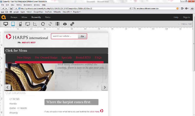
File 1 - Screen shot from emulator on my computer
File 2 - (deleted)
File 3 - Screen shot from iPhone
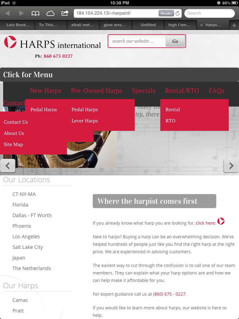
File 4 - Screen shot from iPad
What appears to be happening is this. When I view the site on a PC running a mobile device emulator, and gradually reduce the screen size from PC to mobile size, the navigation bar appears with the text "Click for Menu". Correct text at first, but often reverts to "Site Navigation" after refreshing. New "bouncy" menu behaviour (menu & submenus appear briefly when clicked then disappear).
When I view the site on an iphone, the navigation bar appears with the text "Site Navigation", and bouncy menu behaviour as above.
When I view the site on an ipad, the navigation bar appears with the text "Click for Menu", and the original menu behaviour occurs, that is all menus and sub menus display permanently.
I am testing on different iphones/ipads now so cache is not causing any of the problems.
Thanks again and good luck. I hope you can find a solution. It seems tricky ...
Please Log in to join the conversation.
-
Danimeeka
Active member -
 Topic Author
- Member
-

Less
More
- Posts: 198
- Thank you received: 0
11 years 3 months ago #32157
by Danimeeka
Replied by Danimeeka on topic Modify navigation display on mobile phone version
Please Log in to join the conversation.
-
Danimeeka
Active member -
 Topic Author
- Member
-

Less
More
- Posts: 198
- Thank you received: 0
11 years 3 months ago - 11 years 3 months ago #32158
by Danimeeka
Replied by Danimeeka on topic Modify navigation display on mobile phone version
Last edit: 11 years 3 months ago by Danimeeka. Reason: Whole reply with image not needed again, but I can't delete it seems.
Please Log in to join the conversation.
-
milos
Support Staff -

- Moderator
-

Less
More
- Posts: 6742
- Thank you received: 715
11 years 3 months ago #32162
by milos
Replied by milos on topic Modify navigation display on mobile phone version
Hello,
Please test our demo link demo.hotjoomlatemplates.com/wedding/
I couldn't find any troubles with the menu on this link.
You probably did some modifications in template during development that broke the menu. There could also be some conflicts between the menu and 3rd party modules that you installed. Try disabling them one by one to find which one makes the problem.
Also, I recommend you to install plain Wedding template (HotStart) and compare the menu structure with your working site.
Thanks
Milos
Please Log in to join the conversation.
-
Danimeeka
Active member -
 Topic Author
- Member
-

Less
More
- Posts: 198
- Thank you received: 0
11 years 3 months ago - 11 years 3 months ago #32211
by Danimeeka
Replied by Danimeeka on topic Modify navigation display on mobile phone version
Hi Ivan,
Good advice. I have tried two new installations of the template now
- one on Joomla 2.5 which behaved the same as the demo,
- and one on Joomla 3.0, which the 184.154.224.13/~harpsint/ website is built on. The installation on Joomla 3.0 is at sykes-turner.com/harpsint-joom3 and it has the same fault that we are trying to rectify (sub menus always showing).
So getting closer!
This seems to be an issue on Joomla 3.0 installations. Any suggestions? (Also, just for interest what version of Joomla is the demo on?)
Thanks.
Last edit: 11 years 3 months ago by Danimeeka. Reason: Small changes
Please Log in to join the conversation.
Time to create page: 0.162 seconds


