- Posts: 2
- Thank you received: 0
Template width problem on iPhone5
-
Alex85
Inactive member -
 Topic Author
- New Member
-

Less
More
11 years 1 month ago - 11 years 1 month ago #37422
by Alex85
Template width problem on iPhone5 was created by Alex85
Hey HJT,
First of all, great job. I got multiple templates from u guys and i really like them! Keep up the good work.
I'm trying to finish my website but I seem to have made a little mistake on the way but i don't really now how to fix this.
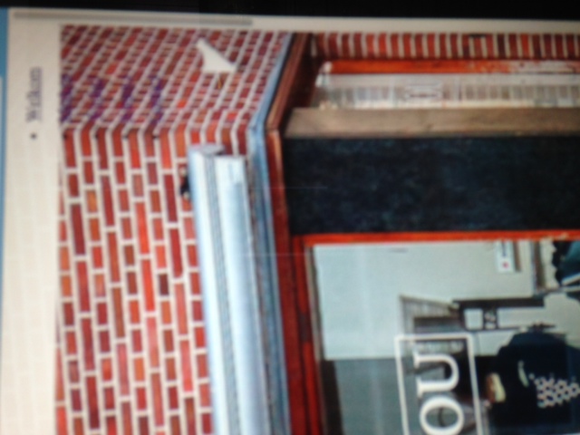
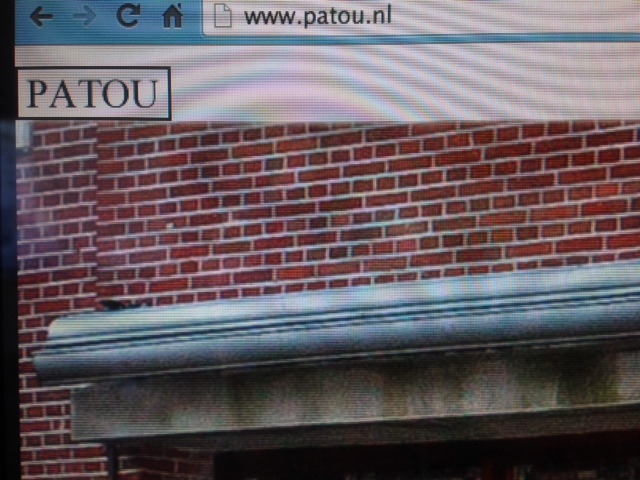
My website is not showing full width on my iPhone.
Here is a picture to show the problem on the bottom of the website:

link: www.patou.nl
Thanks in advance!")
First of all, great job. I got multiple templates from u guys and i really like them! Keep up the good work.
I'm trying to finish my website but I seem to have made a little mistake on the way but i don't really now how to fix this.
My website is not showing full width on my iPhone.
Here is a picture to show the problem on the bottom of the website:
link: www.patou.nl
Thanks in advance!
Last edit: 11 years 1 month ago by Alex85.
Please Log in to join the conversation.
-
ivan.milic
Support Staff -

- Moderator
-

Less
More
- Posts: 14116
- Thank you received: 1639
11 years 1 month ago #37434
by ivan.milic
Replied by ivan.milic on topic Template width problem on iPhone5
What happens when you tab twice to fit page?
Maybe you can try some other viewport value, you have now:
<meta name="viewport" content="width=device-width, initial-scale=1.0">
Maybe you can try some other viewport value, you have now:
<meta name="viewport" content="width=device-width, initial-scale=1.0">
The following user(s) said Thank You: Alex85
Please Log in to join the conversation.
-
Alex85
Inactive member -
Topic Author
- New Member
-
Less
More
- Posts: 2
- Thank you received: 0
11 years 1 month ago - 11 years 1 month ago #37443
by Alex85
Replied by Alex85 on topic Template width problem on iPhone5
Thanks for your fast reply!
With double tap the iPhone zooms out a bit and it shows the full website width but still with the white area on the right.
When playing with the viewport it seems like the problem is solved. The website is showing in full width on viewport=0,5 but its messing up the rest of my website. Even when i put viewport back to 1 it stays messed up so i had to replace the index.php with the original file to make it work again.
Here are some pictures showing problems that appear when changing the viewport (even when put back to 1).
Pic1: on imac (Chrome) : text layout messed up
Pic2: on imac : menu messed up
Pic3: on imac : logo messed up
Pic4: on iphone (Chrome) : showing full width but messed up menu and logo
Pic5: on iphone: show text layout messed up
Hope you can help me out!
Thanks a lot!
Last edit: 11 years 1 month ago by Alex85.
Please Log in to join the conversation.
-
ivan.milic
Support Staff -
- Moderator
-
Less
More
- Posts: 14116
- Thank you received: 1639
11 years 1 month ago #37452
by ivan.milic
Replied by ivan.milic on topic Template width problem on iPhone5
I get "Error displaying the error page: Application Instantiation Error" when I browse your site now
Please Log in to join the conversation.
Time to create page: 0.177 seconds