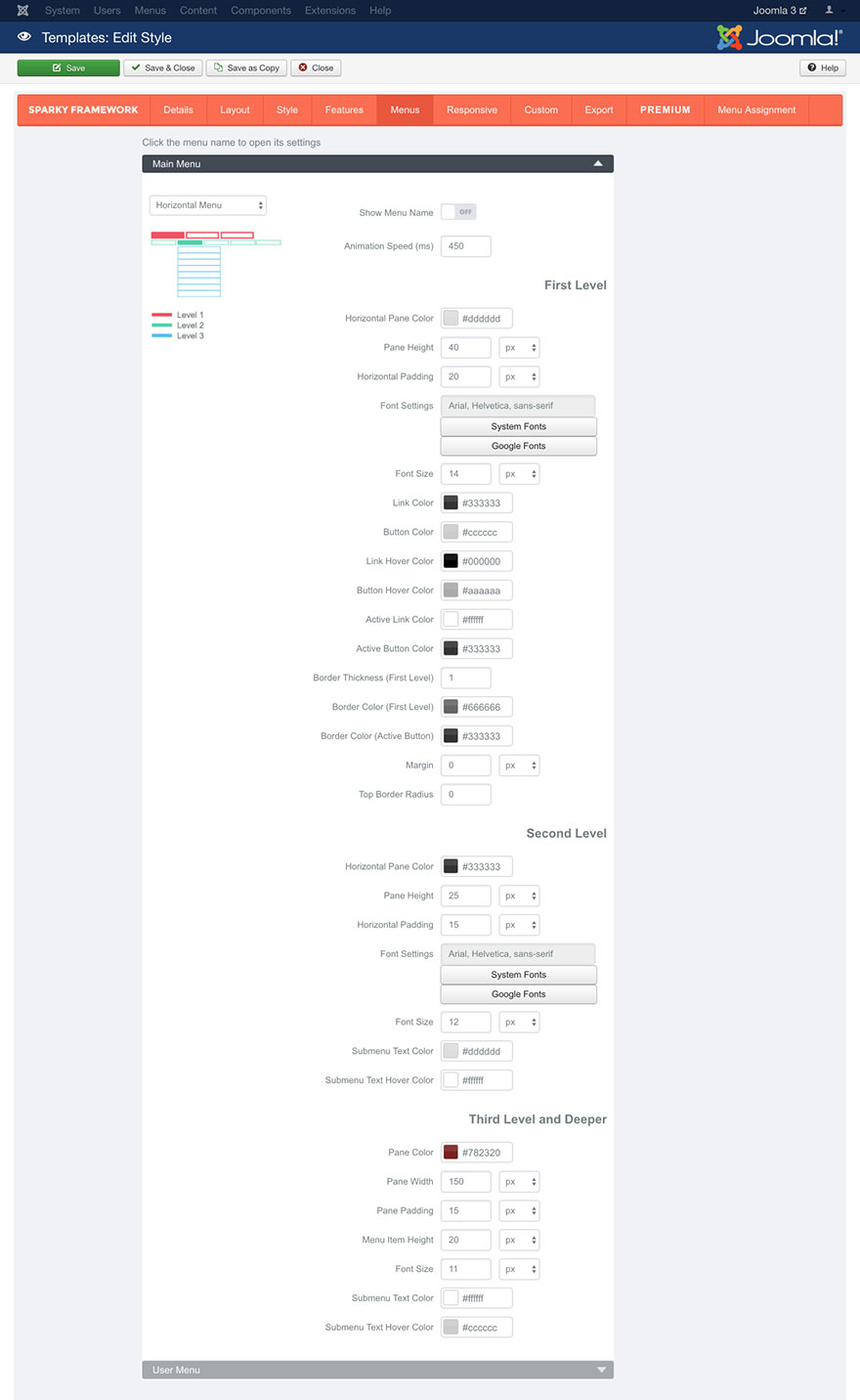
To activate the Horizontal Menu type, open the Menus tab, click on your menu and select Horizontal Menu option from the selector. Many new parameters will become available.
This menu type shows the first level menu icons as well as the second level menu items lined horizontally. The third level menu items and menu items from the deeper levels will be displayed in the drop-down panes, similarly to the Drop-down Menu type.
The menu items from the first level are displayed in a horizontal row. When a visitor moves the mouse pointer or taps first level menu item that contains children, the children menu items (second level) will be displayed in a horizontal row below the row that contains the first level menu items. When a visitor moves the mouse pointer or tap second level menu item that contains children, the children menu items (third level) will be displayed in a drop-down pane below the row that contains the second-level menu items. The menu items from the third and deeper levels are lined vertically in the drop-down panes.

Show Menu Name parameter allows you to include the menu name above the menu items.
Animation Speed parameter defines the duration of the animation in milliseconds.
First Level Menu Items
This set of parameters is related only to the menu items from the first level.
Horizontal Pane Color parameter allows you to select a background color of the pane where the first level menu items are placed.
Pane Height parameter allows you to set height of the pane where the first level menu items are placed.
Horizontal Padding parameter allows you to set horizontal spacing between the first level menu items.
Font Settings, Font Size, Link color, Active Link Color and Link Hover Color parameters works the same way as those we explained in the Style section (read this section for more details).
We will just mention that Active Link Color defines color of the active (current) menu item. If visitor is on the page that’s linked with a menu item, this menu item will be in the active state on the page.
Button Color parameter defines background color of the first level menu items. Button Hover Color defines background color of the first level menu items when mouse pointer is above them. Active Button Color defines background color of the first level menu items when they are in the active state.
Border Thickness (First Level) and Border Color (First Level) parameters allows you to define thickness and color of the border for the first level menu items. You can set a different border color when menu item is in active state in the Border Color (Active Button) parameter.
Margin parameter allows you to set some space around the first level menu items.
Top Border Radius parameter allows you to set rounded corners for the first level menu items. The value should be entered in pixels.
Second Level Menu Items
This set of parameters is related to the menu items from the second level.
Horizontal Pane Color parameter allows you to select background color of the pane where the second level menu items are placed.
Pane Height parameter allows you to set height of the pane where the second level menu items are placed.
Horizontal Padding parameter allows you to set horizontal spacing between the second level menu items.
Font Settings, Font Size, Submenu Text Color, and Submenu Text Hover Color parameters works the same way as those we explained in the Style section (read this section for more details).
Menu Items from the Third and Deeper Levels
This set of parameters is related to the menu items from the third level and all deeper levels.
Pane Color parameter allows you to select background color of the drop-down pane where menu items from the third and deeper levels are placed.
Pane Width parameter allows you to set width of the drop-down pane where menu items from the third and deeper levels are placed.
Pane Padding parameter allows you to set some spacing in the drop-down pane around the menu items.
Menu Item Height parameter defines height of the menu items from the third and deeper levels.
Font Size, Submenu Text Color, and Submenu Text Hover Color parameters works the same way as those we explained in the Style section (read this section for more details).
Note that the font settings (font family, weight and style) for the menu items from the third and deeper levels will be shared with the font settings for menu items from the second level.
Sample
This sample is from Hot Churchly template. This template is available for all premium members.
