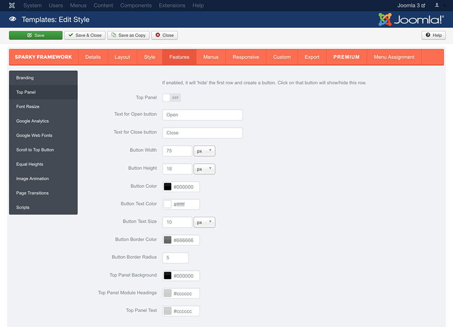
This feature allows you to convert the first row from your layout into a button. When this button is clicked, the entire content of the row will be revealed by sliding it down. When you click the same button again, the first row would become hidden again.

All parameters from this sub-tab will not have an effect if the first parameter is disabled. By enabling the first parameter, you will enable the Top Panel feature for your site.
Button Settings
The following parameters are related to the button itself. You can enter the text that will be on the button when the panel is in an open or closed state. You can define the button size (width and height) as well. Also, the colors of the button background, text, and border are available as parameters. You can also define the text size for the button as well as border-radius. The last parameter will add rounded corners to the button as per the given radius value in pixels.
Panel Settings
The last 3 parameters are related to the colors of the top panel itself. Using the color pickers, you can set the background color of the panel, the color of the headings and the color of the regular text inside the panel.
Sample
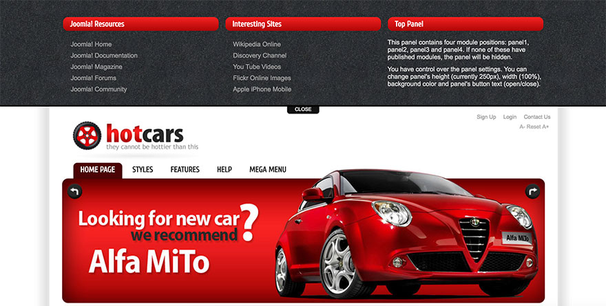
A sample of the top panel with 3 modules inside it. This sample is from Hot Cars template. This template is available for all premium members.
